SV2030 website

We worked with Sustainability Victoria to design and build an engaging web version of their SV2030 strategy report.
The brief
SV2030 is Sustainability Victoria’s vision for transitioning the state to a circular, climate-resistant economy within the next decade. Sustainability Victoria had already produced a report outlining this vision, but wanted to create a summarised, engaging online version to communicate the core goals of the strategy. Sustainability Victoria engaged Tundra to bring this vision to life.
What we did
Balancing progressive disclosure of content
A key challenge of this project lay in determining the right amount of content for the web page. Sustainability Victoria had distilled the SV2030 report into a more web-friendly length, and our team took on the task of determining how to cater for users wanting a high level overview, whilst also providing options for deeper browsing.
We created a series of wireframes that mocked up options for progressive information disclosure, highlighting opportunities for deeper engagement through the use of accordions and text-links to other sections of the Sustainability Victoria site.
Sustainability Victoria’s vision was for the web page to be one continuously-scrollable page. However, to provide users with additional navigation options, we created a slim navigation menu that would animate into the page once the user scrolled beyond the introductory content. This provides users with a direct means of entry into core topics, so they can quickly navigate to the content they’re looking for.

How we did it
Merging campaign brand and parent brand guidelines
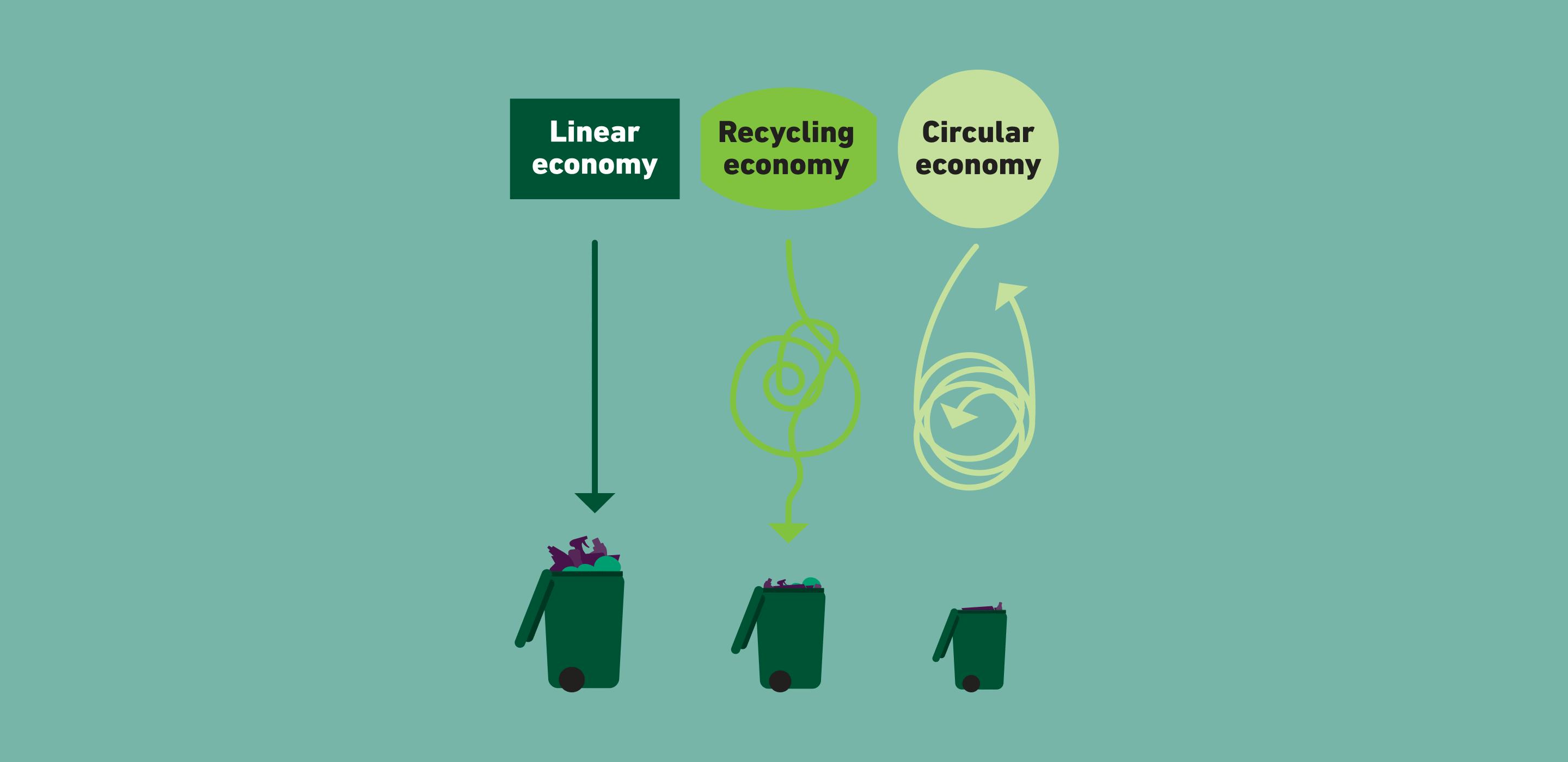
Sustainability Victoria had created a set of brand guidelines for the SV2030 project, which included bespoke illustrations. We brought these brand guidelines and illustrations into the design of the web page, ensuring that it retained the look and feel of the written report.
However, given that sections of the page would be linking to Sustainability Victoria’s core website, we wanted to ensure that this transition was a smooth one. To achieve this, we introduced elements of Sustainability Victoria’s parent brand guidelines into the design of the SV2030 web page, seamlessly blending the two brands to ensure a smooth brand experience for users, no matter which journeys they entered or exited from.
We had fun with the layout and animations on the site to really guide the eye, and encourage users to consume the content most relevant to them.
Bringing the strategy to life with animation
To fulfil Sustainability Victoria’s goal of providing engaging content, we introduced elements of animation to the page. The challenge of this design was how to make animation feel engaging without diluting the importance of the surrounding content.
Our approach was to make sure all animations used were contextual and augmented the content. Different elements of content and infographics animate into the viewport as the user scrolls, and illustrations are brought to life through subtle visual effects. We also took care not to overdo the animation — balancing static content and illustration with the use of motion.
Content manageable for future flexibility
The SV2030 web page was built in Sustainability Victoria’s existing Craft CMS instance, and all content sections are content manageable. This means,Sustainability Victoria has full control over the text content and case studies presented on the page, giving them the flexibility to make adjustments to the narrative of the strategy at any time.
Let's work together
Get in touch