Compare tool

We developed a tool that allows users of the Metricon Homes website to compare home designs, and house and land packages to find the best fit for their needs.
The brief
Following the launch of their new website, Metricon Homes wanted to develop a new Compare feature that would allow users to see their shortlisted home designs, and house and land packages in a side-by-side comparison. To help orient users to this feature, we recommended that the feature be accompanied by an onboarding tool that allows users to tour the new feature and its functionality.

What we did
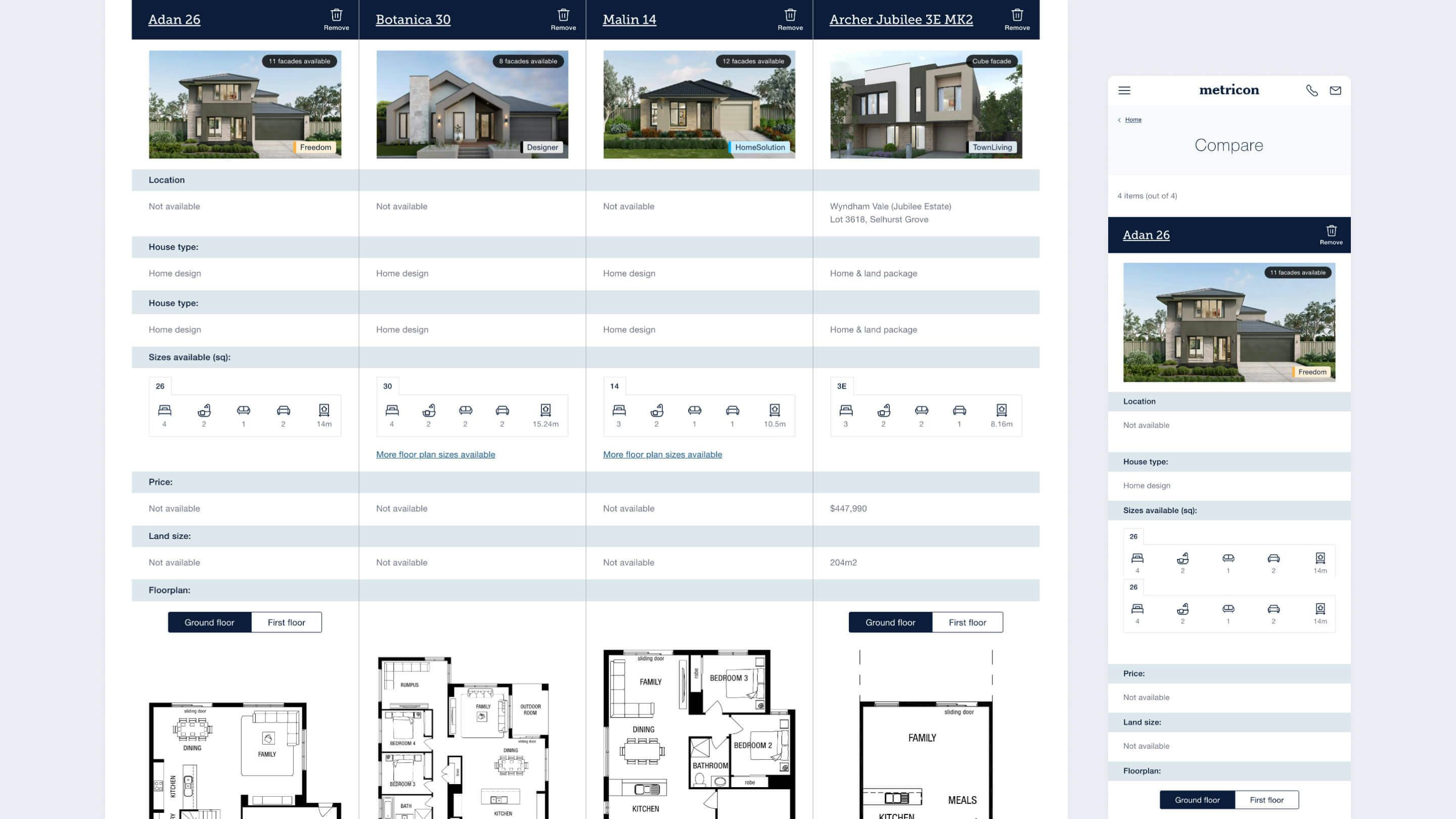
A simplified comparison view
Usability testing during the Metricon Homes website redevelopment project had indicated that comparing home designs and house and land packages was a feature that Metricon customers considered highly valuable. Users reported that they expected to be able to view their comparison in a table, and that they wanted the table to be easy to navigate and read on both mobile and desktop.
With this in mind, we designed a table layout that prioritises key information points about each product, such as the design name, the number of rooms, the floor plan, and the room dimensions. Each design occupies a single column to allow for easy side-by-side comparison, and following user feedback, the Compare feature was limited to four products at a time so as not to be overwhelming.
To improve table navigation on mobile, we designed a single column view with a peekaboo element that shows a hint of the information in the next column. This, combined with a brief overlay animation, indicates to the user that more columns can be viewed using side scroll.
For ease of readability, both the column headings (the design name) and the table rows (the individual features) are sticky on mobile, so users never lose track of where they are in the table as they scroll.

Making it easy to add products
To cover all possible entry points in the user journey, we made it possible for users to add products to their Compare table from both the Home Design and House and Land index pages, as well as from the floor plan viewer on the individual Home Design and Package detail pages.
Once a user clicks the Compare icon, a slide-up widget appears at the bottom of the page, which acts as a holding area for the products the user has added to their Compare tool. Here, the user can see the products they have selected to compare and remove any products they no longer wish to see. A CTA button in the widget takes the user through to the Compare table page, and the widget also includes functionality for initiating the Compare onboarding tutorial, or displaying error messaging if the user attempts to compare more than four products at a time.
Onboarding users to the new feature
To make it easier for existing Metricon users to orient themselves to the new feature, we implemented two onboarding functionalities. The first is a pop-up notification that appears on the Compare button on index pages and within the floor plan viewer. This notification alerts users to the fact that there is a new feature available, and includes a link to initiate the onboarding tutorial.
The onboarding tutorial itself appears as a modal in the centre of the user’s screen, and uses custom animation over a number of slides to instruct users as to how to use the Compare tool.
How we did it
Validating through prototyping and user testing
To validate our designs, we created an interactive prototype in Axure that mimicked the existing Metricon website, with the added functionality of Compare and its associated onboarding tool. We ran usability tests with a number of users, who were asked to compare a range of products and discuss their feedback and expectations of the tool.
Feedback from these sessions indicated that the format of the Compare widget and Compare table was intuitive and easy to use, as many users had experienced similar design patterns on eCommerce websites. As a result, we made the decision to make the Compare onboarding tool user-initiated, rather than forcing the user into an onboarding experience by default when they landed on a page with a Compare button.
While users appreciated the ability to compare across product types (i.e. to compare Home Designs with House and Land Packages), they also indicated that they would expect to be able to compare multiple floor plans from the same Home Design side-by-side in their Compare table. This feedback had flow-on effects for the design of the active, inactive, and disabled states of the Compare buttons on the index pages and floor plan viewers, and we experimented with a number of designs to ensure that it would be clear to a user which floor plans they had added to Compare as they toggled through floor plans for a particular Home Design.

Solution
The new Compare tool provides users with a simple and intuitive way to compare different Metricon products across both home designs and house and land packages. For users seeking more information, the onboarding tutorial provides a concise and instructive explanation of the tool, further empowering users to take control of their home design search.
Impact of the work
Within the first 12 hours of launch, the Compare tool saw over 400 page views, and ranked within the top 15 pages of the site. The Compare page also recorded an average time on page almost double that of other site pages.
Through user testing, we were able to validate and refine our design to make sure we were meeting user needs at every stage of the journey.
Let's work together
Get in touch