Website redesign and redevelopment

We worked with efm Logistics to design and develop a bespoke new website that better reflects their position as leaders in the market. It showcases the strong, people-focused culture that underpins their success.
The brief
As the leading fourth party logistics provider across Australia and New Zealand, efm Logistics was looking to revitalise their public-facing website to facilitate better connections with prospects and current customers. efm engaged us to provide a creative website design that emphasised content and thought leadership, while showcasing the talented people that make efm so unique and successful.

What we did
Understanding audience mental models
To kick off the project, we undertook a series of user research sessions to gain a better understanding of efm’s customer base, what information they were looking for in the prospecting phase, and how the existing website influenced their perception of the efm brand. A key focus for this research phase was to determine how well efm’s audience understood the concept of fourth party logistics, and identify the language they used to articulate their needs. From these sessions, we were able to document requirements for the intended functionality and design for the new website, as well as provide a series of content and terminology recommendations for the efm marketing and brand team to implement in their content writing activities.

Content design that educates and persuades
As part of the UX and content design process, we gave consideration to the most effective way to communicate efm’s unique value proposition to prospective customers. Working in a complex industry, efm faces the challenge of communicating the benefits of fourth party logistics to an audience who may have little to no knowledge of this concept.
We took a ‘wide and shallow’ approach to the site’s information architecture, prioritising ease of access by placing key pages at the top level of the site structure. Page names were written in plain language that highlights the benefit and value efm’s services offer to clients, eliminating jargon while improving user comprehension.
Given that efm’s target audience is typically time-poor, we designed content pages with clear information hierarchies, prioritising clear, benefit-oriented heading styles that allowed for easy scanning of content. The design is composed of reusable components that give efm’s marketing team flexibility in the creation of new content, whilst maintaining best practice information design.
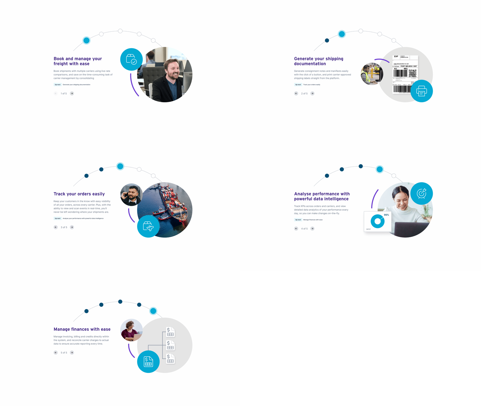
To further aid user understanding of efm’s business model and value proposition, we designed two custom, interactive infographics to support key pages of the website. These infographics allow us to concentrate key value propositions into a smaller area of page real-estate, and present an opportunity to increase user engagement through interactive elements.

A design that echoes the efm brand proposition
To support efm’s goal of showcasing their people and culture, we undertook a photo and video shoot at the efm head office and one of efm’s warehouse locations to capture the business in motion. The new site design uses this photography in page headers, CTA blocks, and throughout content pages to bring a sense of personality and trust to the content, while highlighting efm’s strong commitment to customer service.
The new site design combines a generous use of white space with an extended brand colour palette to bring additional personality and visual interest to each component. A new icon set was introduced, and the typography was augmented through the addition of a highlight animation to emphasise key words in the page headings.
Animation adds a touch of playfulness to various interactions throughout the site. The homepage banner makes use of a rotating circular animation that pays homage to efm’s logo and recalls their brand promise of ‘end-to-end supply chain solutions’. This circle motif is echoed in other animations and design treatments throughout the site as the page scrolls, or forming part of custom graphic device use to illustrate key concepts.
This project gave us the opportunity to think outside the box and find new ways to communicate complex business concepts with clarity and creativity, helping both efm and its customers achieve their goals.

Solution
The new website presents a modernised and simplified view of the efm business that echoes their brand promise of ‘no better experience’. With a streamlined, functional approach to navigation and site UX, the site both educates and persuades its users, using smart content design to promote readability and scannability. Animation and custom graphic devices add playfulness and promote interaction, with a clean design and extended colour palette to carry the brand forward into the future.
The new website showcases efm’s customer service focus and strong emphasis on culture, which is already having a measurable impact on both recruitment and business development.


Tundra invested heavily in understanding our business first, and provided astute direction throughout the process and in order to get the right outcome. It was a pleasure for all team members and customers involved.
Let's work together
Get in touch