Closing the deal: the power of point-of-action assurances

Whether someone is about to complete a purchase on an eCommerce site or sign up to your weekly newsletter, the point at which a website visitor is ready to take action is delicate.
At this crucial point, a visitor could lose confidence in their decision and not take the action you want them to take. So how do you maintain visitor confidence? That's where point-of-action assurances come in.
In this article, we will explore the significance of point-of-action assurances in website conversion optimisation and discuss strategies for their effective implementation. The following is only intended as a general guide, and everyone's situation is unique. If you need help improving your website's performance, speak to us.
What are point-of-action assurances?
Point-of-action assurances are best described as website elements that exist to instil and maintain trust at critical junctures of the conversion process. They can act as reminders of why a person should take the intended action, or they can work to overcome potential objections the individual may have. Site elements such as security notices, testimonials and free shipping notices are all examples of point-of-action assurances.
Why use point-of-action assurances?
Point-of-action assurances play an important role in convincing your website visitors to take action by:
Building trust and credibility
At its heart, sales is a transfer of trust. You want your potential customers to trust that your service or product will meet their needs.
Example: Customer reviews and testimonials are powerful tools to build trust, while trust badges and certifications prove a website's credibility.
Overcoming objections and doubts
Doubts and objections are common when a visitor is about to convert. Point-of-action assurances deployed at relevant moments in the conversion process can help address those concerns.
Example: Notices about customer privacy can address concerns about handing over personal information, while free trials and money-back guarantees reduce the perceived risk of taking action.
Reducing friction
Clear and concise messaging removes ambiguity from the conversion process, providing a seamless and frustration-free experience which helps build conversion momentum. For example, clear statements about shipping times give customers a sense of certainty around this common eCommerce enquiry, building confidence in continuing the transaction.
Types of point-of-action assurances and how to use them
Security assurances
In the early days of eCommerce, a lack of familiarity with transacting online meant the security of sensitive information like credit card details was at the forefront of most people's minds. For this reason, it was common to see checkout buttons, for example, surrounded by security badges and statements about security.
These days, purchasing online is far more commonplace and customer anxieties around online payment are significantly reduced, particularly with the advent of third-party payment platforms like PayPal.
That said, anxiety around providing payment details online still exists. A 2023 study by research group The Baymard Institute found that 19% of shopping cart abandonment occurs due to customers not trusting a website with their credit card information.
For this reason, it is still important to address security, even in this day and age of a more online-savvy population.
You need only look to Amazon to see how important security is as a consideration. Despite arguably being the world's most trusted eCommerce platform, Amazon frequently references site security at multiple points of the transaction process, from sign-in to checkout.
As you can see from the Amazon example below, they don't go overboard and let their security markers get in the way of the shopping experience. Instead, they incorporate references to security at key interaction points, either making them a part of the call to action (such as with the account sign-in button) or presenting them close to critical calls to action, as seen with the add-to-cart panel.


Tips for implementing security assurances
- Ensure your site has a valid and up-to-date SSL certificate (a digital certificate that authenticates a website's identity and enables an encrypted connection). Even if you aren't taking payments online, the lock icon in your visitors' web browsers (indicating a valid SSL certificate) will provide confidence that any transfer of information is secure.
- Reference security at any point the user may enter personal information. Personal information can be anything from credit card numbers to personal contact details and passwords. Let your visitors know their details are safe.
- Keep the messaging simple. Point-of-action assurances exist to support a conversion process, not to get in its way. Security messaging should be quick to understand and not take attention away from the action you want your visitors to take. In the example below, you can see how the message that the site is secure gets lost amongst the numerous icons, significantly impacting the effectiveness of the security messaging.

Social proof
Social proof is the modern, web-equivalent of word of mouth approval. Social proofs validate the value of your products or services by using the voice of others. When potential customers see how popular your product or service is, or read about others’ positive experiences, they’re more likely to trust your brand.
Social proof comes in many forms, enough to be the subject of an article unto itself. In the context of point-of-action assurances, the most useful forms of social proof are listed below.
Reviews
A 2021 survey of 1,200 online shoppers by Bizrate Insights revealed that when given a choice between a discount, a loyalty program, free shipping or a high review score, more customers chose a high review score as the most important factor in their purchasing decision.
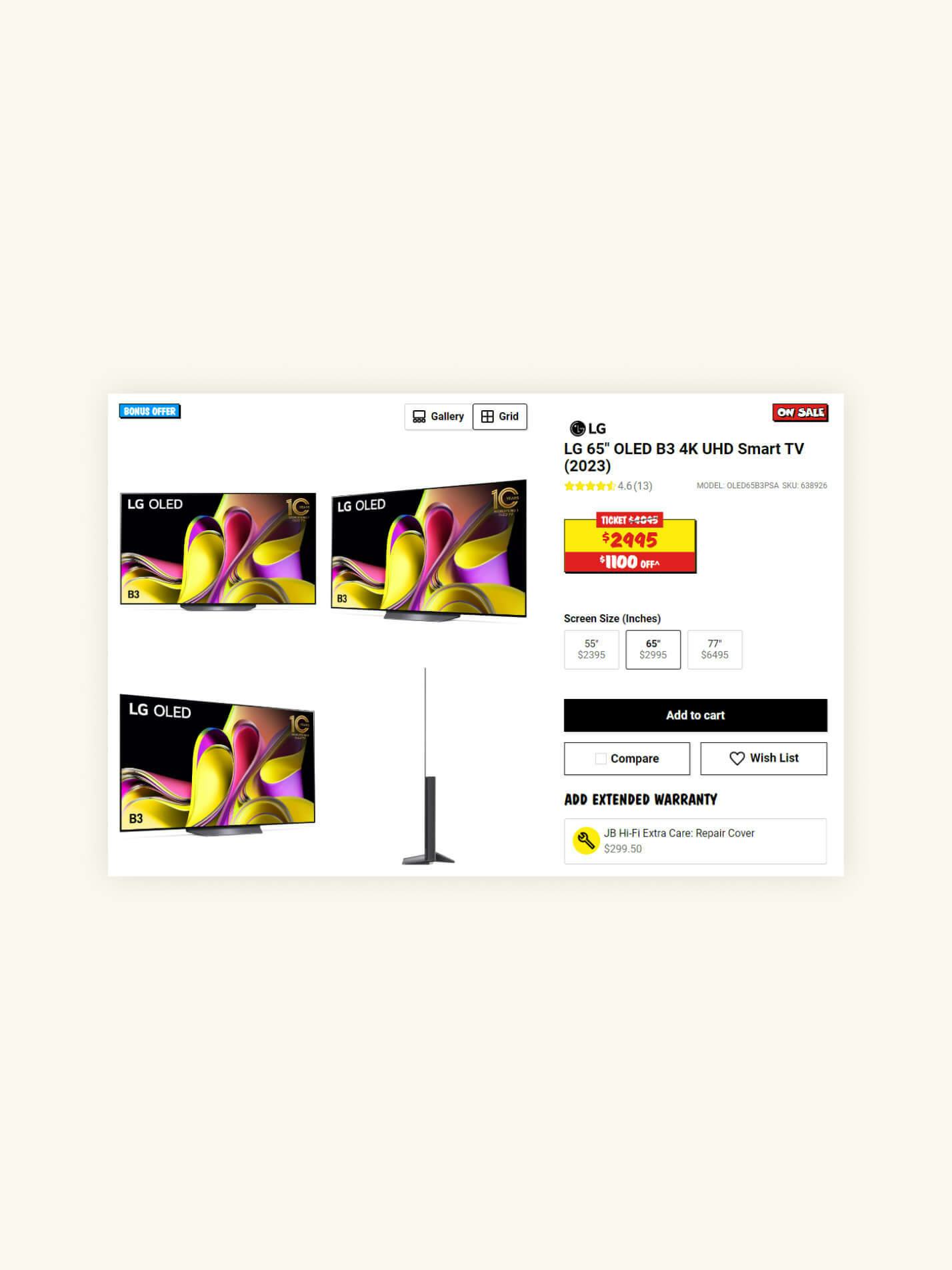
For eCommerce sites, product reviews are an expected feature and placing review scores near the main purchasing area of your product pages is an easy win. For example, see how JB Hi-Fi positions the review score right within the main purchase area of the page — right at the point where a customer may need that little boost of confidence to nudge them over the line.
Review scores can also help potential customers browse for products as well. Displaying review scores on product listings can make the shopping process smoother for customers, giving them more confidence to learn about specific products. Again, JB Hi-Fi is an excellent example of this. As you can see in the example below, the available review scores help quickly narrow down options. Many shoppers will immediately gravitate to the first two televisions listed, instantly focusing their shopping efforts.

Even if you don't run an eCommerce website, review scores can be a powerful conversion tool. Services like Trustpilot can be beneficial, providing an automated way to collect and display user reviews about your business on your site.
In the below screenshot you’ll see how ABN Australia displays their 5-star Trustpilot badge alongside the page's primary call to action to underline their trustworthiness.

Testimonials
You can think of testimonials as a more curated and personal review. Unlike the reviews above, organisations typically solicit and curate customer testimonials to showcase positive feedback.
Testimonials can be helpful on your site in various contexts but come into their own when displayed close to important points of action in the customer journey. The following screenshot (on the left) taken from a journaling website is a good example of using testimonials to support the user's decision to join the workshop.
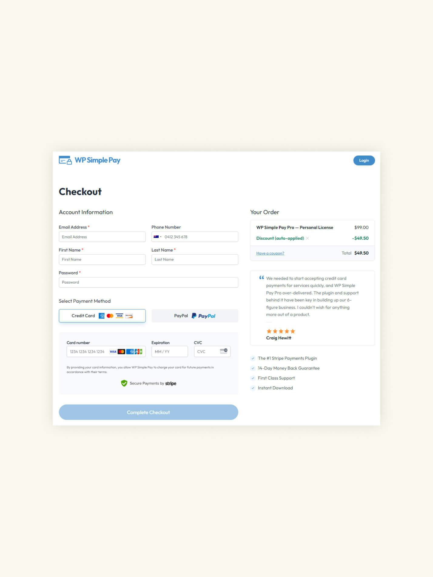
Implementing testimonials next to points of action for eCommerce sites can be more challenging. Given the space taken up by testimonial content, including this kind of social proof next to an add-to-cart button risks adding distracting noise to the purchase process. On the other hand, your checkout pages can be perfect for this kind of display, as shown in this example from WP Simple Pay (right).

Client logos
Even without testimonials, your clients can still act as social proof. If you have prominent, well-known clients, let your visitors know who they are. The fact that successful businesses use your goods or services sends a strong signal that your offering is of a high quality.
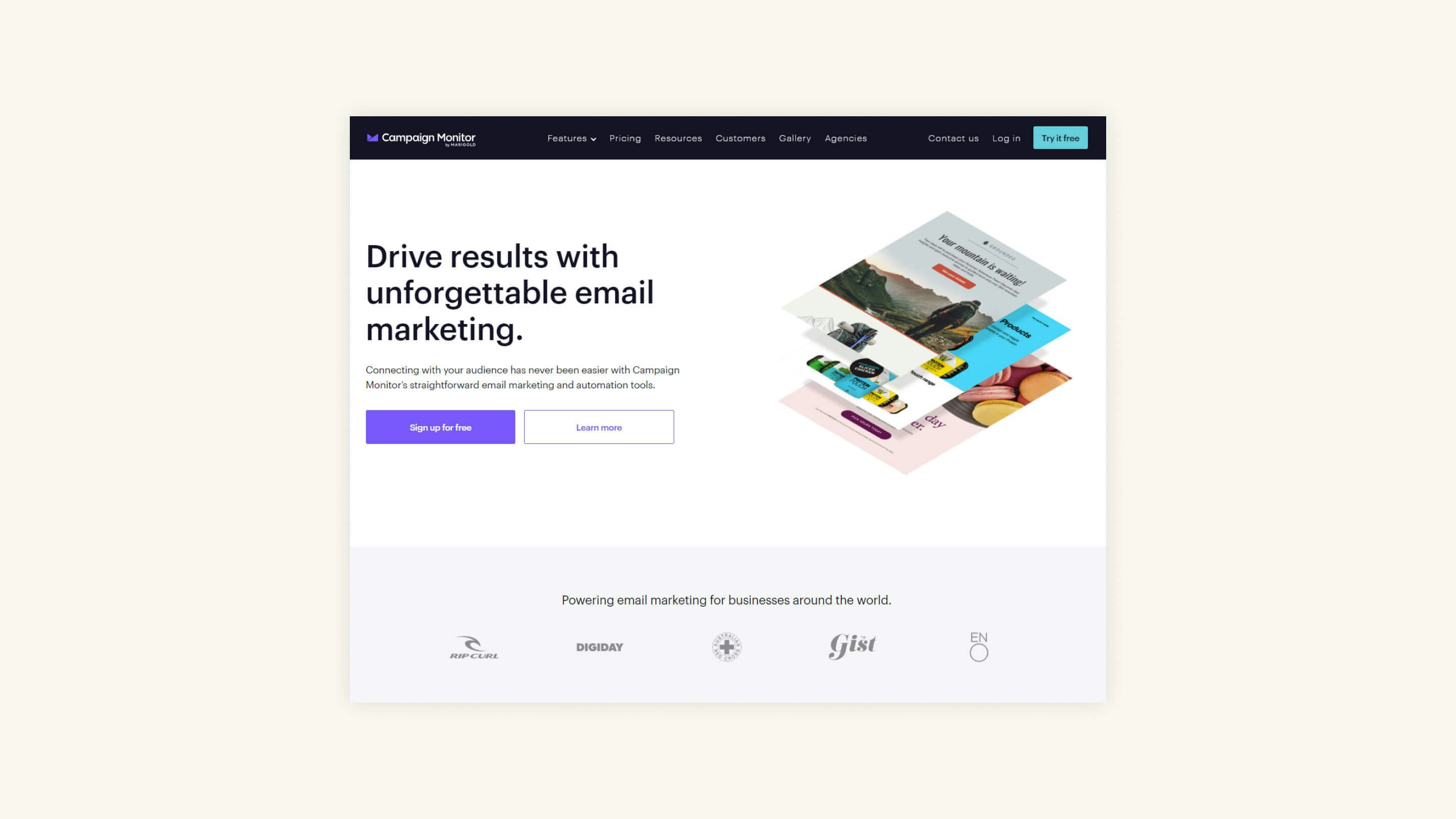
Campaign Monitor's homepage is a strong example of how you can use client logos as a social proof form of point-of-action assurance.
Campaign Monitor has been clever with their implementation of client logos. The placement is such that their presence is noticeable enough to remind users that well-known businesses use this service, but not so noticeable that they distract from the primary and secondary calls to action. They’ve also gone one step further and presented the client logos in a monotone format to ensure the presence of additional colours doesn't impact the dominance of the primary CTA.
Big numbers
Sometimes sheer volume is as powerful a recommendation as any individual review or testimonial. The most extreme example is no doubt McDonald's, with their famous slogan—Over 99 Billion Served.
While using numbers in this manner is not a direct statement of the quality of your product or service, the inference is that the quality must be there since the numbers are so high.
These statements make for versatile point-of-action assurances. You can even work them directly into a call-to-action message, as Trustpilot does on their primary business page (left).
Even an action as minor as a newsletter signup can benefit, as shown in this example on the right from the Sanfilippo Children's Foundation.


Tips for implementing social proof
- Provide opportunities for your customers to provide reviews and testimonials. If you are an eCommerce site, email users after receiving your product and invite them to leave a review. If you are in the professional services industry, reach out to clients you have a strong relationship with and ask if they would like to speak about their experience with your business.
- Place review ratings prominently near points of action, whether that’s an add-to-cart button or a signup form.
- Remember, when using social proof as point-of-action assurances, its role is to support the primary call-to-action, not usurp its importance on the page. When using testimonials, only place them where they don't add unnecessary noise to the conversion path. When using client logos, consider making them grey-scale if they draw attention away from your CTAs.
- Ensure your social proof markers are authentic. The general public is surprisingly good at detecting the difference between marketing copy and someone's genuine thoughts about your product or service. If you're caught making stuff up, it can be worse than never having had social proof present in the first place.
Transparency elements
People like transparency in their transactions and dislike ambiguity. Sometimes, the 'how' of service or product delivery can be just as important as the 'what'. When we refer to transparency elements, we are speaking about those site elements that aim to clarify your process at critical moments in the conversion journey.
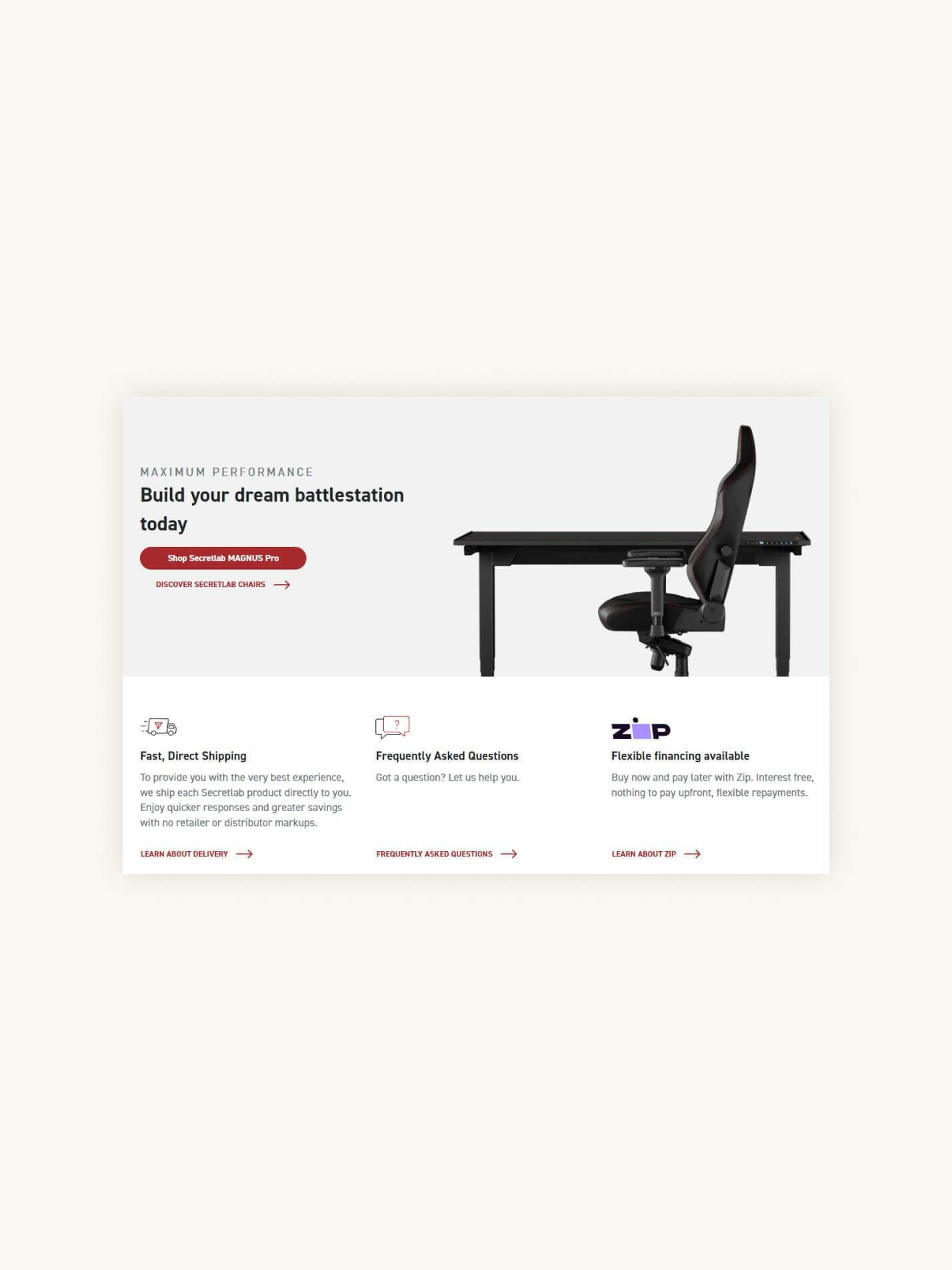
Free shipping, privacy and refund policies all fall under this categorisation. If your customers can benefit from your process or policies, let them know. For example, Furniture manufacturer Secretlab promotes their fast shipping and financing options close to purchase calls-to-action on their product pages.
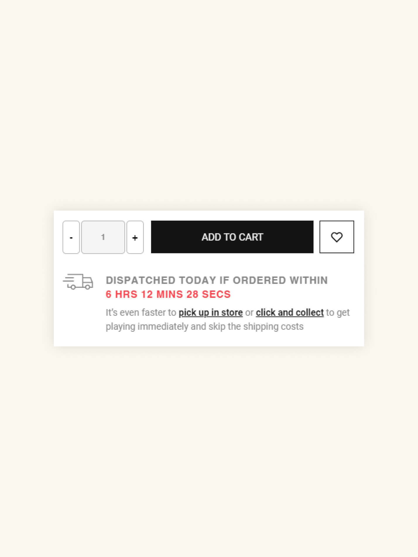
The eCommerce store Gameology addresses the question of shipping times by explicitly calling out when you need to order by to ensure same-day dispatch.
Sometimes, the process is so intrinsically tied to the product that a more detailed explanation is required. Free trials are an excellent example of this. While almost always beneficial, free trials can raise many potential objections from customers, especially if they must provide payment details in advance. In such situations, it is important to be crystal clear about the free trial process so your customers don't feel locked into a course of action they don't want to take.
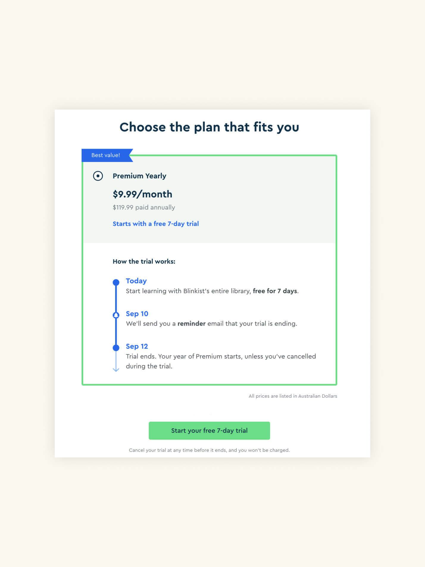
Blinkist (left) does an excellent job of explaining their free trial clearly and enticingly. The openness of their process is particularly compelling as it emphasises customer control — at several points, the supporting assurance copy references the ability of the customer to cancel their trial at any time, even to the point where Blinkist provide reminder emails so people don't unwillingly roll over into a paid plan. They even re-emphasise this aspect of the trial directly below the primary call to action.
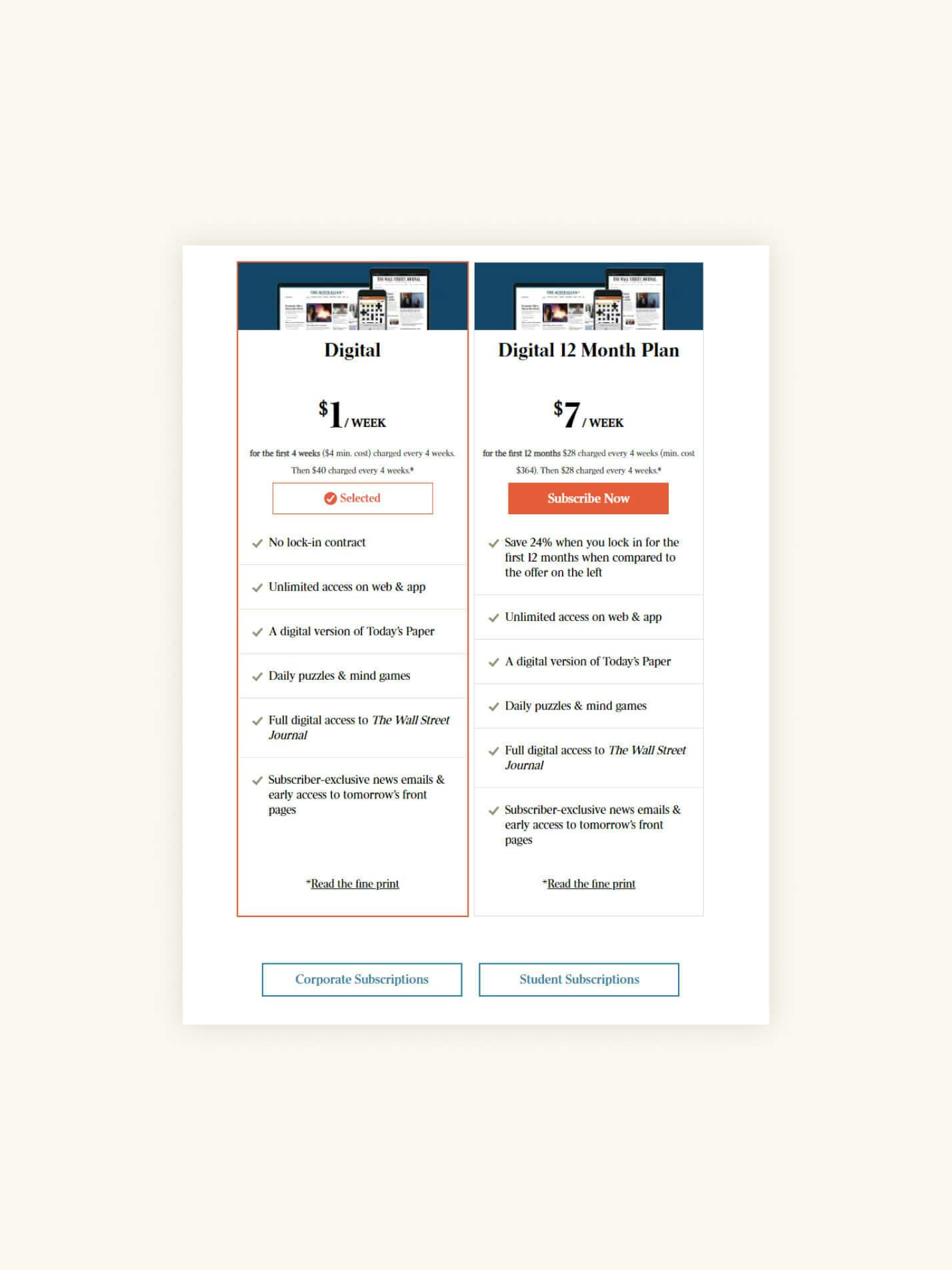
By comparison, The Australian newspaper (right) does a much poorer job of providing the clarity people demand when assessing trials. Yes, The Australian's offer is inherently less appealing since it requires (reduced) payment upfront, but it’s also not presented as clearly or appealingly as Blinkist's. The focus on customer control is almost entirely absent, and despite being written in a manner that suggests a cheaper trial period, the pricing for the 12-month plan is a fixed cost. Finally, we must reserve some criticism for the 'read the fine print' call to action. Members of the general public never use 'fine print' as a positive, so its use here is likely to cause more anxiety than less.
Tips for implementing transparency elements
- Consider the possible objections a potential customer may have about your products or services. If an aspect of your product or service counters an objection, raise it at the point where the objection is likely to occur. For example, having contact details passed on to third-party marketing companies is a legitimate concern many Internet users have. If you never pass on customer details to third parties, communicate this fact on subscription forms.
- Be clear in your messaging. The point of transparency-focused point-of-action assurances to enhance understanding and confidence. If you explain your process poorly, you risk generating even greater anxiety instead of less.
- Only explain as much as you need to explain to counter customer objections. Using the subscription form example, you don't need to display your entire privacy policy next to a signup form to assure customers that you won't sell their personal details. Instead, it’s enough just to make the core claim. For example, ‘We value your privacy’. If more specific information is required, you can link to relevant policy or explainer pages; in this example, that would be your site's privacy policy page.
Conclusion
Your website is your online shop front and salesperson in one. But unlike in-person salespeople, it’s far more challenging for your website to hear customer objections and respond appropriately. Even though tools like web chat offer real-time opportunities to speak to your customers, they exist outside the primary conversion path.
For these reasons, it is important to pre-empt your customers' objections and address them before they are voiced. Point-of-action assurances are a powerful way to achieve this. By addressing common objections when they are likely to arise, you can create a smoother path to conversion and help your customers achieve their goals more seamlessly.
Do you need help getting your customers over the line? Speak to Tundra today to learn how we can help make your online presence a success.
Let's work together
Get in touch