Explore our latest insights and industry trends.

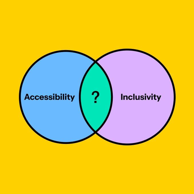
Accessibility and Inclusivity: what's the difference?
Accessible and inclusive – a pair of words that are often inseparable or used interchangeably.

Closing the deal: the power of point-of-action assurances
Whether someone is about to complete a purchase on an eCommerce site or sign up to your weekly newsletter, the point at which a website visitor is ready to take action is delicate.

The world's population is ageing rapidly. Designers need to take notice.
As the world's population steadily ages, the imperative to design digital products that cater to their needs becomes increasingly pressing. Designing for older people isn’t just a matter of inclusivity, but a pathway to creating digital experiences which benefit everyone.

The dangers of assumption-driven design
No matter your role within an organisation, it's easy to fall into the trap of making assumptions and letting them guide your decision-making.

How accessibility helps your SEO
When we think about accessibility, we often think about it in isolation, or just in relation to user experience. However, improving the accessibility of a website can have flow-on effects for SEO. Here’s a range of strategies to both improve your website’s accessibility and SEO.

A/B and multivariate testing: Part II test
A step by step guide to A/B testing and multivariate testing your website to improve your conversion rate.

My freshman year as a Tundra designer
Monday morning. Blasting some bangers through the office and bopping at my desk in our final working week of 2023, and it got me reflecting on my first full year as a Digital Designer at 188 Gertrude St, Fitzroy...

10 basic steps to make your website accessible
Accessibility should be one of the primary concerns of anyone who works in the online space. Ensuring websites are usable by everyone is not just important; it is essential.

Why you need a UVP (and how to create one)
In the online space, where competitors are a click away, your website must communicate what makes you different to prospective clients/customers quickly and effectively. One of the most powerful ways of doing this is through a unique value proposition (also known as a unique selling proposition) statement.

AB and Multivariate Testing for Success: Part I
Optimising your website is crucial to engage prospects and drive growth in today's business landscape. But with so much riding on the success of your website, making even small changes to your website carries considerable risk.

What is a headless CMS?
What a headless CMS is and how it fits into the modern web development environment.

A guide to UX/UI localisation
There’s a lot to consider when it comes to localisation, from font choice to iconography. Here are our top tips for designing for international markets.

How well do you know your customer? Consumer trends in 2023
The pandemic left some obvious and life-changing impacts on society, from a growing remote work culture, to the rapid digitisation of every aspect of our lives and a hyper-awareness of our health.

How to migrate to Google Analytics 4
Understanding how users interact with your website is critical for making informed decisions about your online presence. Businesses worldwide spend vast resources on website analytics each year to ensure they are squeezing every last drop of performance from their online presence.

Why we keep coming back to Craft CMS
We’ve been working with Craft CMS since 2017. Find out why it delivers best on our clients’ requirements.

Our four studio values
Over time, we’ve simplified how we talk about what matters. As a small, focused studio, we don't revisit our values occasionally. They show up in how we work every day, how we collaborate, and how we make decisions. At the centre of it is a simple idea. Strong teams with a shared purpose produce the best work.